Calmara (Concept)

Calmara is a meditation and yoga app designed to help users find tranquility and balance in their busy lives. With a sleek, minimalist interface and soothing color palette, Calmara offers guided sessions, breathing exercises, and mindfulness practices to promote relaxation and mental clarity. The app's user-friendly design ensures a peaceful experience from start to finish, allowing users to unwind, recharge, and embrace inner calm.

Client:

Conceptual

Role:

Brand Designer

Year:

2023

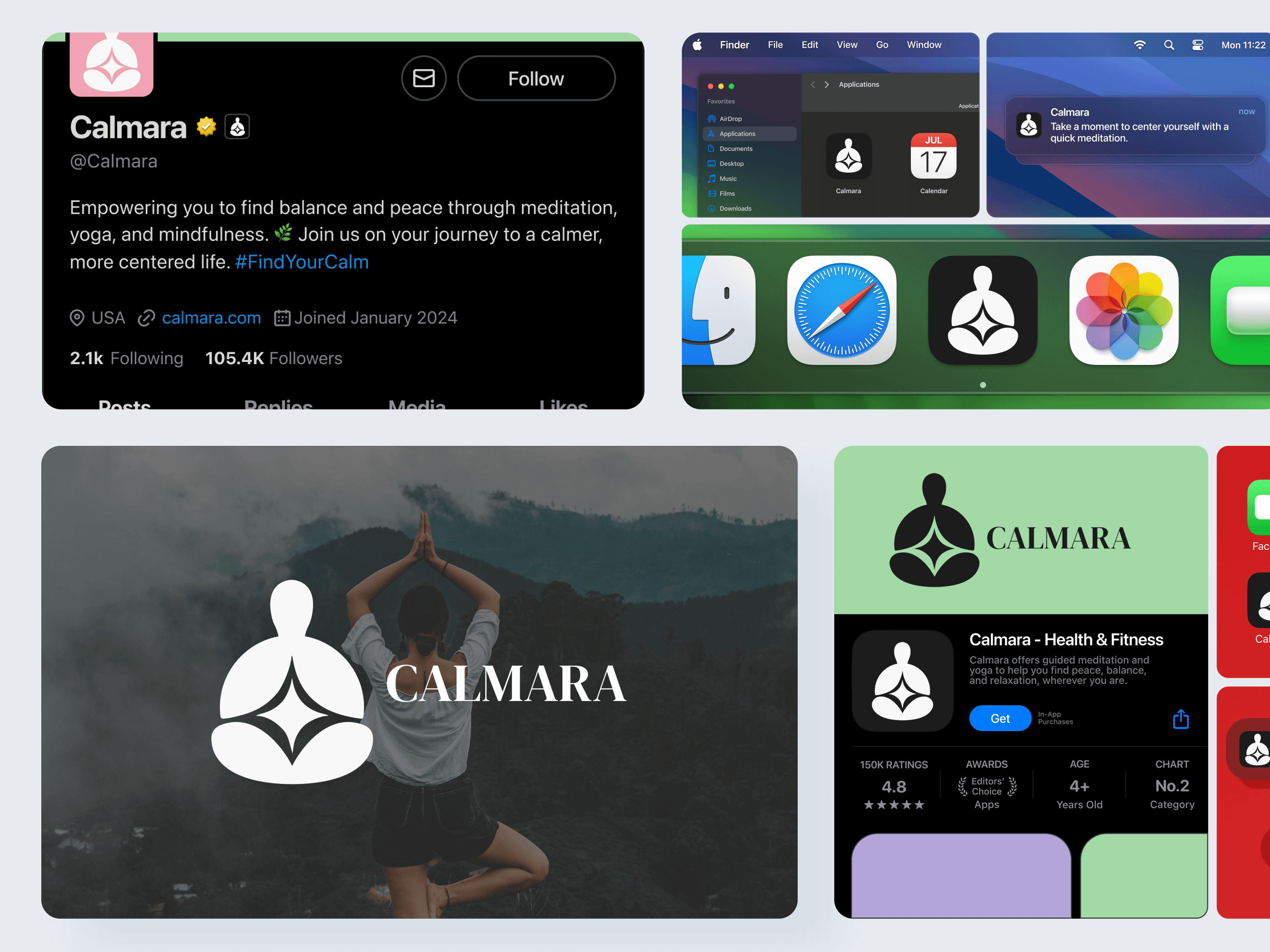
Calmara Thumbnail
Calmara Thumbnail
Calmara Logos
Calmara Logos

Process

The process of designing Calmara’s brand guidelines involved crafting a cohesive and calming visual identity that aligned with the app's purpose of promoting relaxation and mindfulness. Here’s how I approached it:


  • Defined a serene and minimalist color palette to evoke tranquility.


  • Selected typography that balanced elegance with readability.


  • Designed a logo and iconography that reflected simplicity and mindfulness.


  • Created a flexible layout system to ensure consistency across platforms.


  • Iterated on designs to maintain accessibility and functionality while preserving the app’s calming aesthetic.

Color Palette and Typography

Color Palette, Typography & Intergration

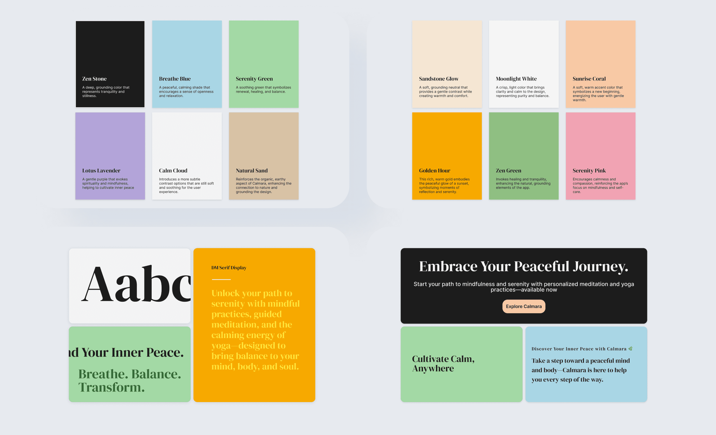
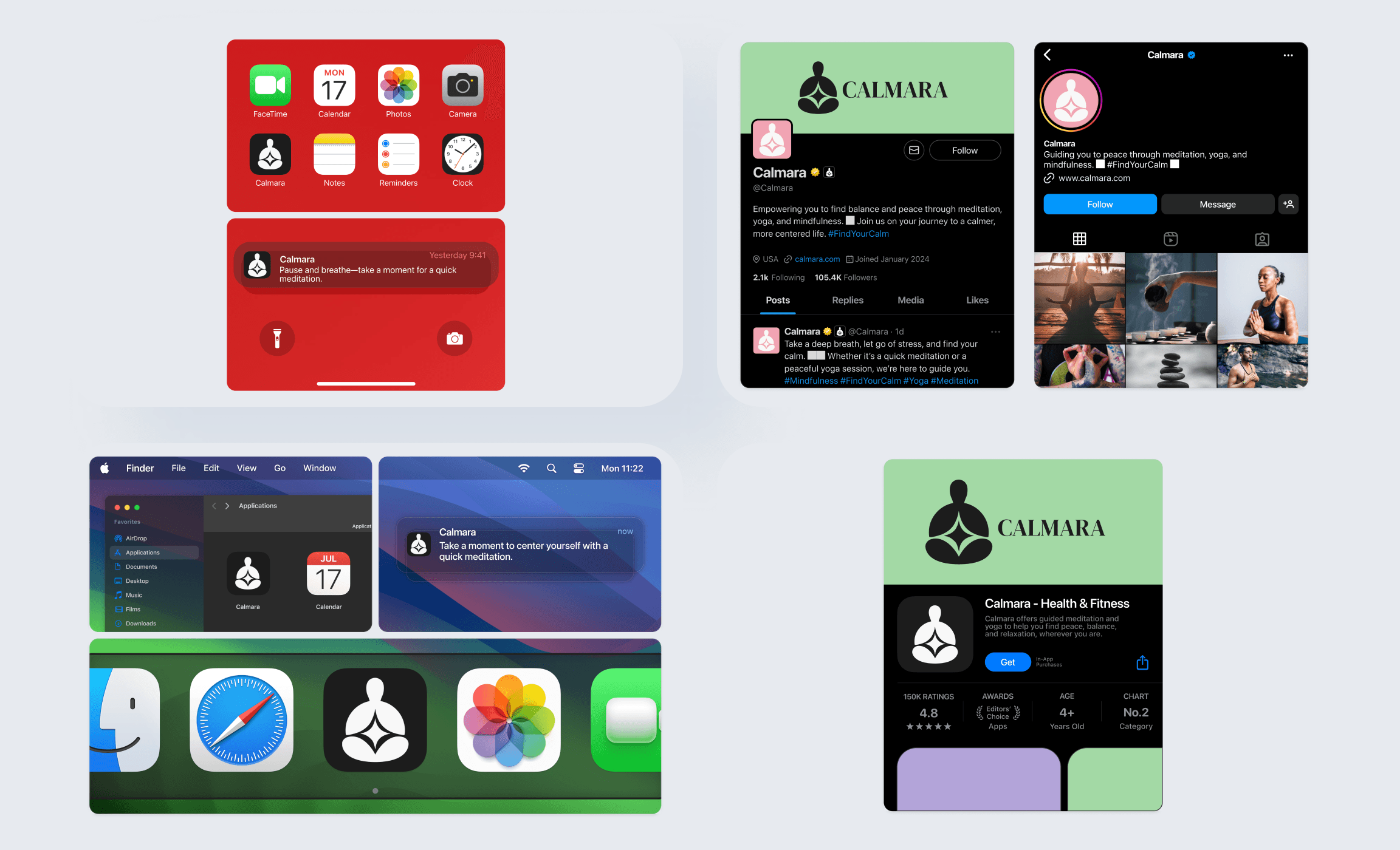
The color palette for Calmara was designed to inspire tranquility, featuring soft, natural tones that promote relaxation and balance. Typography complemented this aesthetic with a refined serif typeface paired with a clean sans-serif for optimal readability. The design also ensured seamless integration with macOS and iOS, creating a cohesive and intuitive experience across Apple platforms.

Color and Typeface
Color and Typeface
Intergration
Intergration

Key takeaways

Designing the brand guidelines for Calmara focused on creating a serene and functional visual identity that embodied mindfulness and calm. The color palette featured soft, natural tones to promote relaxation, while the typography paired an elegant serif with a modern sans-serif for readability and balance. Special attention was given to ensuring seamless integration with macOS and iOS platforms, providing a consistent and intuitive experience across devices. The result was a cohesive design system that prioritized accessibility, visual harmony, and a calming aesthetic that resonated with users.